When Amanda Escobar set out to create Providence Hill Academy, she had a powerful vision: to build a Christ-centered school that seamlessly blends academic excellence, faith, and real-world learning. Nestled on a peaceful working ranch in Weatherford, Texas, Providence Hill offers a unique educational experience that’s as enriching as it is transformative.
But to bring this vision to life and connect with the right families, Amanda needed a brand that felt as intentional, distinctive, and rooted in purpose as her mission. That’s where we came in.
A Brand Identity That Reflects Faith, Learning, and Leadership
At Aardvark Communications, we were honored to help launch Providence Hill Academy from the ground up. Amanda partnered with us to create a complete brand identity, starting with the foundation: logo design, color palette, brand voice, and a custom website that would capture the heart of the school and serve as a compelling digital front door.
Crafting a brand goes beyond selecting fonts and pretty colors. A great brand communicates who you are, what you believe, and why people should trust you. For Providence Hill Academy, each piece of their brand needed to point back to their belief that education should ignite wonder, inspire leadership, and build a foundation of unwavering faith.
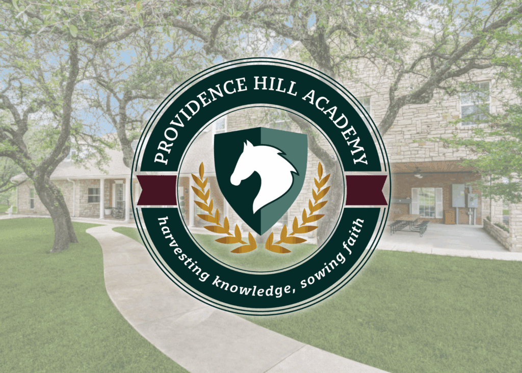
Designing a Visual Identity
The first element we focused on was the logo. One of the main offerings that makes Providence Hill Academy unique is its equestrian program, so we knew a horse needed to take center stage. The equestrian program teaches students confidence, discipline, and leadership.
As an academic institution, we also wanted the logo to convey prestige and legacy. We designed a classic crest to reflect academic excellence, anchored by strong serif typography and sophisticated styling. Jewel-toned greens and rich gold further underscored the school’s commitment to both professionalism and spiritual richness.
To ensure flexibility across platforms and materials, we built out a full logo suite: a crest emblem, a circular logo, a horizontal logo, and a distinct logo mark for social media and apparel. The result is a timeless brand that communicates strength, trust, and tradition.
Giving the Brand a Voice
Next, we developed Providence Hill’s brand voice, one that’s warm, inspiring, faith-forward, and full of wonder. We worked closely with Amanda to capture the heart behind the school and articulate the distinct value it offers, including hands-on learning, discipleship-driven instruction, and a supportive hybrid model that empowers both students and parents.
The tagline, “Harvesting knowledge, sowing faith,” encapsulates the school’s dual focus. It is rooted in spiritual growth and academic preparation.
A Website That Welcomes and Converts
With the visual identity and voice established, we brought the brand to life online with a beautiful, functional website. Designed to resonate with like-minded families, the site offers a seamless experience, from exploring the school’s unique programs to understanding its faith-based philosophy and hybrid model.
The website was built to inspire, but also to inform and convert. With intuitive navigation, strong SEO structure, and thoughtful content, it provides families with everything they need to take the next step toward enhancing their child’s education.
Why Professional Branding Matters
Providence Hill Academy is a powerful reminder of what happens when passion meets purpose and how a strategic brand can elevate that message. Whether you’re launching a new business or refining an existing one, investing in professional branding ensures you make the right first impression and connect with the people who matter most. A great brand builds trust, drives engagement, and grows your organization.
Ready to Build Your Brand?
Whether you’re launching a new venture or refreshing your existing brand, Aardvark Communications is here to help you create a visual identity and digital presence that truly reflects your mission.
Contact us today to start your branding journey.


